Every year I look forward to seeing the chosen Pantone Colors of the Year and this years colors could NOT be any more beautiful together! Especially when decorating with the two - check out this awesome guest post from
Luxe Decor!
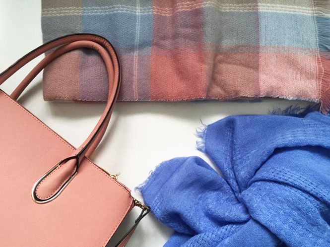
2016 marks the first year that Pantone named two different colors for its annual "Color of the Year" selection. This
year’ s picks are Rose Quartz (a soft shade of pink) and Serenity (a relaxing sky blue tone). Light and airy, these delicate, chalky pastels are perfect for springtime decorating. Here are our tips and tricks for decorating with Pantone’s Colors of the Year:
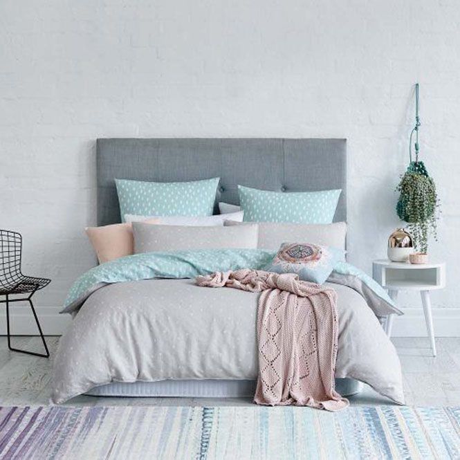 Image via Adairs
The soft muted tones of these two shades bring a sense of relaxation to any space. The calming effect of these colors makes them perfect for the bedroom. Whether you choose to incorporate Pantone's Colors of the Year with a simple lamp or an entire bedding set, Rose Quartz and Serenity are sure to make your space more peaceful and exceptionally chic.
Image via Adairs
The soft muted tones of these two shades bring a sense of relaxation to any space. The calming effect of these colors makes them perfect for the bedroom. Whether you choose to incorporate Pantone's Colors of the Year with a simple lamp or an entire bedding set, Rose Quartz and Serenity are sure to make your space more peaceful and exceptionally chic.
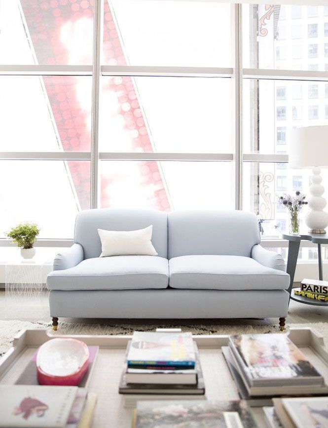 Image via Domino
Seating is an easy way to rock these shades in a big way. With a few tweaks, a light blue Serenity couch or a powdery pink Rose Quartz arm chair can easily be incorporated into your bedroom or living room set-up. If you want to save a few extra dollars, consider re-upholstering a chair or couch you already own with a Pantone inspired fabric.
Image via Domino
Seating is an easy way to rock these shades in a big way. With a few tweaks, a light blue Serenity couch or a powdery pink Rose Quartz arm chair can easily be incorporated into your bedroom or living room set-up. If you want to save a few extra dollars, consider re-upholstering a chair or couch you already own with a Pantone inspired fabric.
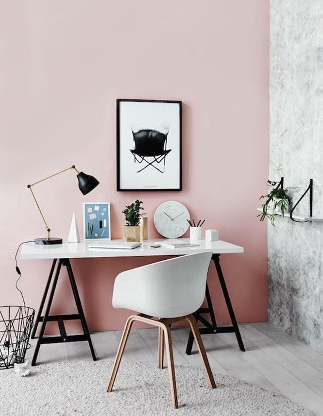 Image via Better Homes and Gardens
Since these two gorgeous shades pair so well with other colors as well, consider using them as a statement wall to dress up an office or dining space. A painted wall of Rose Quartz or Serenity might just be the perfect pop of color your space needs to jazz up your neutral décor.
Image via Better Homes and Gardens
Since these two gorgeous shades pair so well with other colors as well, consider using them as a statement wall to dress up an office or dining space. A painted wall of Rose Quartz or Serenity might just be the perfect pop of color your space needs to jazz up your neutral décor.
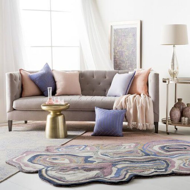 Image via LuxeDecor // All Items From Surya
If you aren’t ready to commit to an entire wall of color, try out Rose Quartz and Serenity first by using accessories; a great temporary option. Accessories are a safe but stylish way to experiment with these shades. Before you start throwing in pillows at random, consider what you’ll be pairing these colors with. Pantone recommends joining the shades with other mid-tones including greens and purples, rich browns, and all shades of yellow and pink. For a splash of color or a hint of sparkle, add in silver, gold, or vibrant brights.
Shop the Look:
Image via LuxeDecor // All Items From Surya
If you aren’t ready to commit to an entire wall of color, try out Rose Quartz and Serenity first by using accessories; a great temporary option. Accessories are a safe but stylish way to experiment with these shades. Before you start throwing in pillows at random, consider what you’ll be pairing these colors with. Pantone recommends joining the shades with other mid-tones including greens and purples, rich browns, and all shades of yellow and pink. For a splash of color or a hint of sparkle, add in silver, gold, or vibrant brights.
Shop the Look:
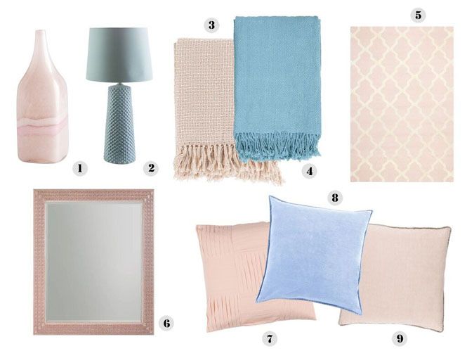 Cyan Design Tiffany Pink & White Vase // Surya Wesley Blue Table Lamp // Surya Tierney 50'' x 60'' Pastel Pink & Ivory Throw // Surya Turner Sky Blue Throw // Safavieh Cambridge Light Pink and Ivory Area Rug // Stanley Furniture Preserve Rose Cabot Wall Mirror // Surya Gilmore Salmon Throw Pillow // Surya Velvet Sky Throw Pillow // Surya Sasha Taupe Throw Pillow
For more Serenity and Rose Quartz decorating inspiration visit Luxe Decor on Pinterest!
What do you think of the Pantone colors of the year?
Thank you so much to Luxe Decor for this guest post!
XOXO
Bloglovin|Facebook|Pinterest|Instagram
Cyan Design Tiffany Pink & White Vase // Surya Wesley Blue Table Lamp // Surya Tierney 50'' x 60'' Pastel Pink & Ivory Throw // Surya Turner Sky Blue Throw // Safavieh Cambridge Light Pink and Ivory Area Rug // Stanley Furniture Preserve Rose Cabot Wall Mirror // Surya Gilmore Salmon Throw Pillow // Surya Velvet Sky Throw Pillow // Surya Sasha Taupe Throw Pillow
For more Serenity and Rose Quartz decorating inspiration visit Luxe Decor on Pinterest!
What do you think of the Pantone colors of the year?
Thank you so much to Luxe Decor for this guest post!
XOXO
Bloglovin|Facebook|Pinterest|Instagram


That is a really pretty color. I didn't even know there was such a thing as a color of the year.
ReplyDeleteI love that Pantone picked two colors as their Color of the Year this year. I really like Rose Quartz but the colors go great together.
ReplyDeleteI love these colours. They are gorgeous in their own right but they also complement each other perfectly.
ReplyDeleteWish you didn't live so far, cause I could use your designer expertise for when I decide to decorate my home in the future ;)
ReplyDeleteI love all the pale colors! They go perfectly together!!
ReplyDeleteWhen did we get colours of the year and why is this the first time I have heard about this!?!
ReplyDeleteBoth of these colours are gorgeous but I love the rose quartz. So pretty!
I LOVE LOVE LOVE that color. In fact, I have a bridesmaid dress in the rose quartz. Guess I should look into selling that, huh!? LOL! I would love to incorporate these colors into my home.
ReplyDeleteI must say I'm happy with the color selection for this Spring, soft a soft comfy tone! love all the pictures, especially the bedding... which could be because I'm tired!
ReplyDeleteI tend to go for bolder colors, but I really love these soft muted tones. They have a very calming feeling, which I think is perfect for this time of year.
ReplyDeleteI'm not a huge color person, but I do love muted shades of blues and pinks. I love these pantone colors! Great inspiration here for decor! Love that blue couch.
ReplyDeleteI love both of these colors, they are perfect for spring! Great post!!
ReplyDeleteI love the colors! I didn't know these two were trending, I was just aware that pastels are in this year. Those are really lovely ideas. Rose quartz is easy to pair with my favorite colors!
ReplyDeleteI'm not really a fan of the first one, but I do love Serenity. It's such a calming color.
ReplyDeleteI love both of these colors...I am not usually a fan of pastels..but these two colors look so lovely together and I LOVE this guest post..! Thanks for ALL your help on my blog....you are amazing...that is all!
ReplyDeletexo
xo
Valerie
Who would have thought that those two colors would have worked so well together. I didn't even know they were the color of the year either. Guess you learn something new everyday.
ReplyDeletethose are really looking food furnitures and colours indeed pantone colour this year is perfect combo!
ReplyDeleteI love the bedroom colors. I have dark stuff in our master. We have kept a navy, red, brown theme over the years.
ReplyDeleteI'm drooling over these amazing designed rooms. I love the soft palette for spring
ReplyDeleteOh my, lovely colors. You featured amazing style and design at this post. Love it!
ReplyDeleteI have pink walls in my office and adding these extra colors would be such a nice touch! I actually want to cover my dining room chairs with new colors, these have me inspired.
ReplyDeleteI love the serenity, but I did rose in the 80's and I'm not sure I can go back. It's all so pretty though... maybe a few accessories.
ReplyDeleteThese colors make me feel like curling up to read a good book before a nap, they scream spring and relaxation to me.
ReplyDeleteOh what a classy and cute color scheme. Thanks for the idea!
ReplyDeleteWow, these colors go GREAT together! You definitely have to make sure the shades are right for each color though. Great for Spring!
ReplyDeleteOh my! I love all of these colors together! I really love that bed set!
ReplyDeleteI love the set up and the colors was really great
ReplyDeleteI'm not crazy about the colors this year. They are just too light for me. Having kids and pets, decorating with these colors would be a disaster!
ReplyDeletePastels aren't usually my thing, but I'm so in love with this year's colors! These decorating tips are fantastic!
ReplyDeleteI would love to style any room in my home with these colours. They are so pretty, I think they'd be perfect for just about any room! - Jeanine
ReplyDeletewow, I so love those colors. Very relaxing and therapeutic to the eyes. Thanks for sharing.
ReplyDeletewww.gregdemcydias.com
I"ll admit....I didn't like thesse colors when they were announced! But I love the idea of a rose quartz throw blanket :) Great post!
ReplyDeleteI've seen so many posts about fashion in Pantone's new colors but I LOVE that you took a spin on it and did homegoods. So lovely. Thank you for sharing!
ReplyDeleteNice photos and idea. So cool and relaxing color scheme.
ReplyDeleteI love both rugs, the lamp, and the vase!!! What a pretty color scheme.
ReplyDeleteI am in love with the pantone colors of the year! They are so light and fresh. Cusions and lamps are such great ways of incorporating them. These colors add such a sense of calm! All the pics are giving me major #decorationgoals :D thank you for sharing. Hope you are having a good week!
ReplyDeleteLove,
Monika | www.palateforstyle.com
I love both these colors!! Both of these colors look so lovely together.
ReplyDeleteI love this years colors of the year and I love your decor picks! I especially love the pink marble vase!
ReplyDeleteWe solve your problems 'quickly and safely at the lowest possible price.'
ReplyDeletePosted on June 12, 2019
Little Brown Bats and Big Brown Bats: How to Know If You Have a Bat Problemشركة مكافحة حشرات
شركة مكافحة النمل الابيض بالرياض
شركة مكافحة الصراصير بالرياض
4164B833A9
ReplyDeleteTakipçi Satın Al
Footer Link Satın Al
Telegram Coin Botları
Pasha Fencer Hediye Kodu
Rise Of Kingdoms Hediye Kodu
182E6D3C
ReplyDeleteKayseri
Tokat
Yalova
Maraş
Nevşehir
Edirne
Van
Zonguldak
Kars